1985 Shopping App
Web app that provides remote access to healthcare services.
Experience the future of mobile shopping with 1985, a user-friendly app that streamlines your shopping process. Enjoy features that let you save favorites, find deals, and track orders with ease.
ROLE
UX/UI Designer
TOOLS
Miro, Zoom, Figma, Slack
PROCESS
Research, Ideation, Wireframing, Hi-Fi Mockups, Developer Handoff
PROBLEM
Mobile users face challenges with online shopping due to poor functionality and usability, such as difficult checkouts and order tracking. Brands often favor desktop sites over mobile, leading to inconsistent user experiences. Luxury fashion brands in particular often deter direct mobile purchases, causing repeated frustration for users shopping on multiple sites.
SOLUTION
To tackle mobile shopping issues, I developed 1985, a feature-rich, user-friendly app. It provides missing functions from traditional sites, like saving products, finding deals, quick checkouts, and order tracking. Additionally, 1985 recommends products based on user preferences, following brands, liked items, and trending products.


SECONDARY RESEARCH
While doing secondary research, I found the most common problems mobile shoppers experience.
No Wishlist
Consumers often use carts as a future reference, not purchasing immediately. They may forget items or find retrieval bothersome when sites don't auto-save their selections.
Slow Checkout
Many customers have said that too many steps in the checkout process are one of the main reasons that they do not shop on their mobile devices.
Product Discovery
On large screens, customers view product image, information, and reviews simultaneously. On mobile, they typically view these elements one at a time.
Security Concerns
Statista shows 35% of people avoid mobile shopping over security fears. Retailers should thus offer diverse digital payment options for customer convenience.
Lack of Incentive
Coupons and discount codes are proven incentives for online shoppers. Offering mobile only promotions increases the incentive for users to shop on their mobile devices
Filling in Forms
Form-filling on mobile is often frustrating. Using technologies like location services and account synchronization can enhance purchase completion rates.
PRIMARY RESEARCH
To gain insight into how users online shop, I used screener surveys to recruit participants. After interviewing them and collecting the data, I was able to synthesize my findings into affinity groups, empathy maps and personas.
Surveys
I first created a screening survey to find participants who online shop frequently and to evaluate how people shop across different sites.
Interviews
Then I conducted user interviews in order to get a better understanding of users' current shopping journeys and painpoints.
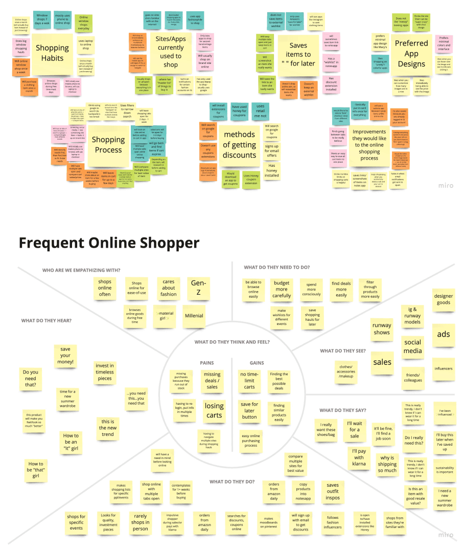
Affinity & Empathy Mapping
With all the notes and recordings from the interviews, I created an affinity map with six categories. I then categorized my notes to create the "Frequent Online Shopper".
PERSONAS
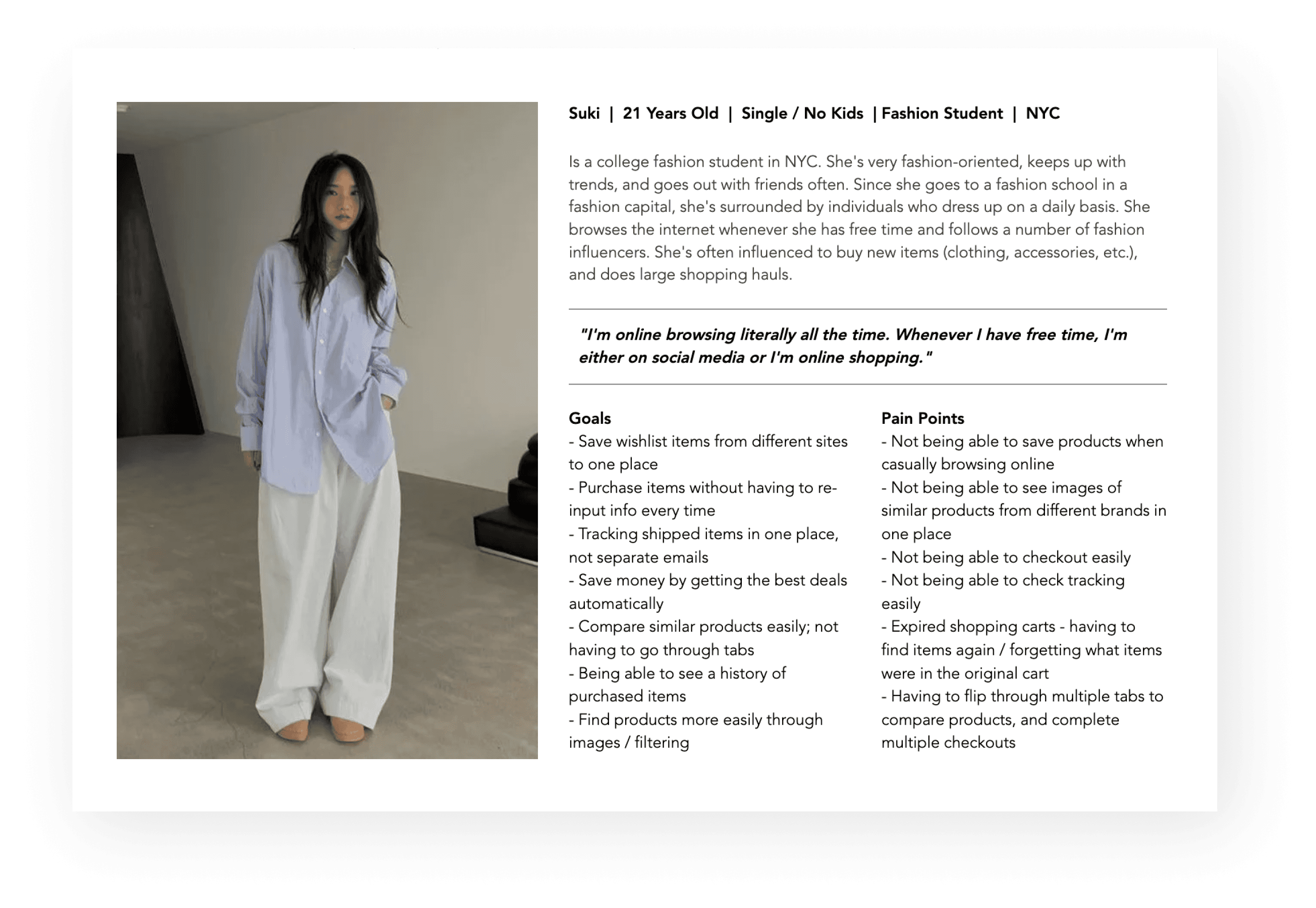
After my research, I created personas to help understand who is the product’s users, what their frustrations and goals are, and how they will use the product.
USER STORIES
Before designing, I prioritized the app's crucial functions. By ranking user stories, I identified essential features for a seamless experience.
High Priority
I want to be able to track all my orders in one place so that I can check the shipping more easily.
I want to be updated when an item I want is on sale so that I can get it at the best price.
Medium Priority
I want to be able to compare items from different stores easily.
I want to be updated when an item I want is on sale so that I can get it at the best price.
Low Priority
I want to able to categorize my saved items.
I want to be able to see all my purchases so that I can track how much money I’m spending.
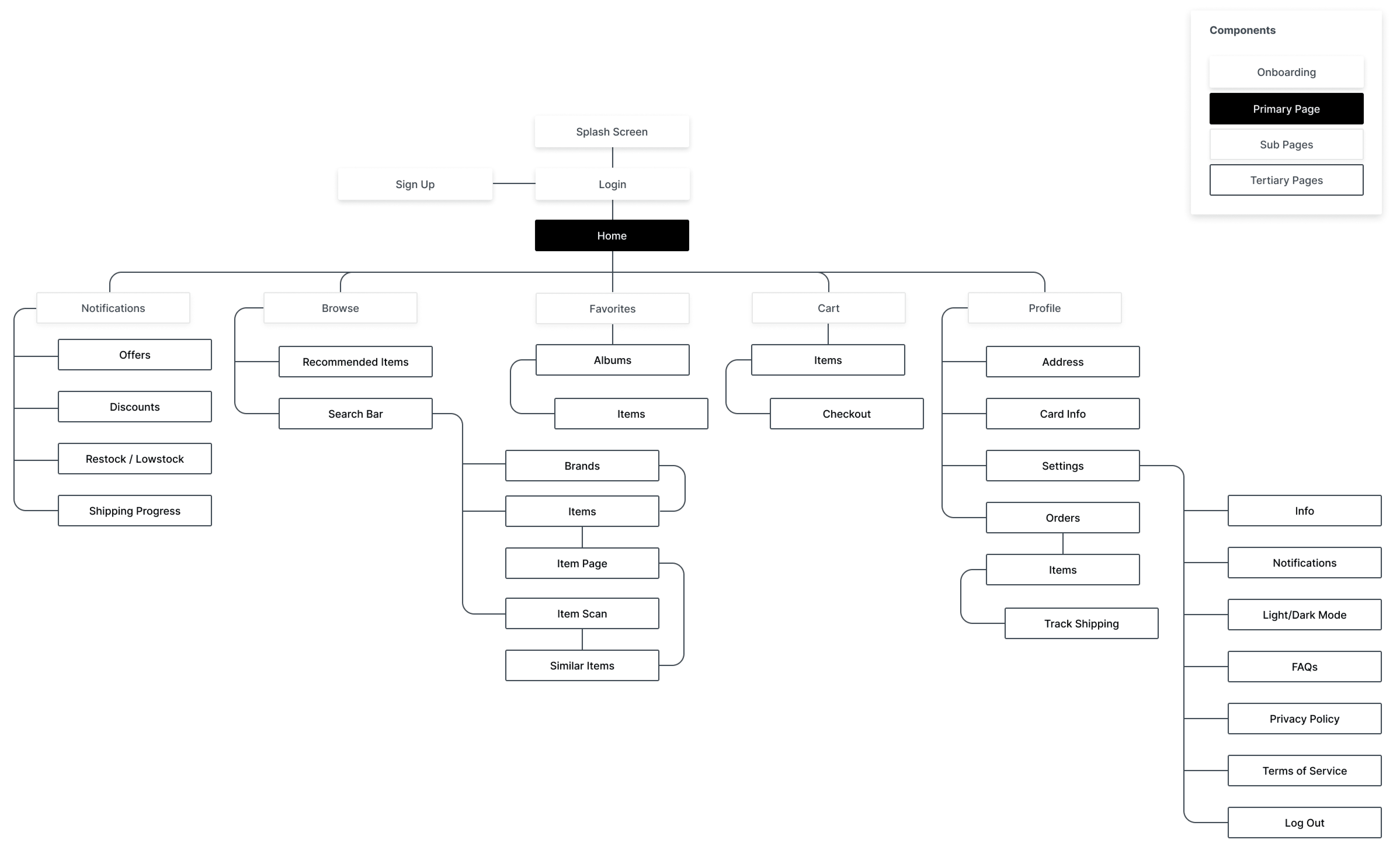
SITE MAP
With a clearer understanding of user requirements, I developed a sitemap inspired by intuitive navigation found in social media apps like Instagram. This ensured comprehensive inclusion of all essential information, functions, features, and screens.
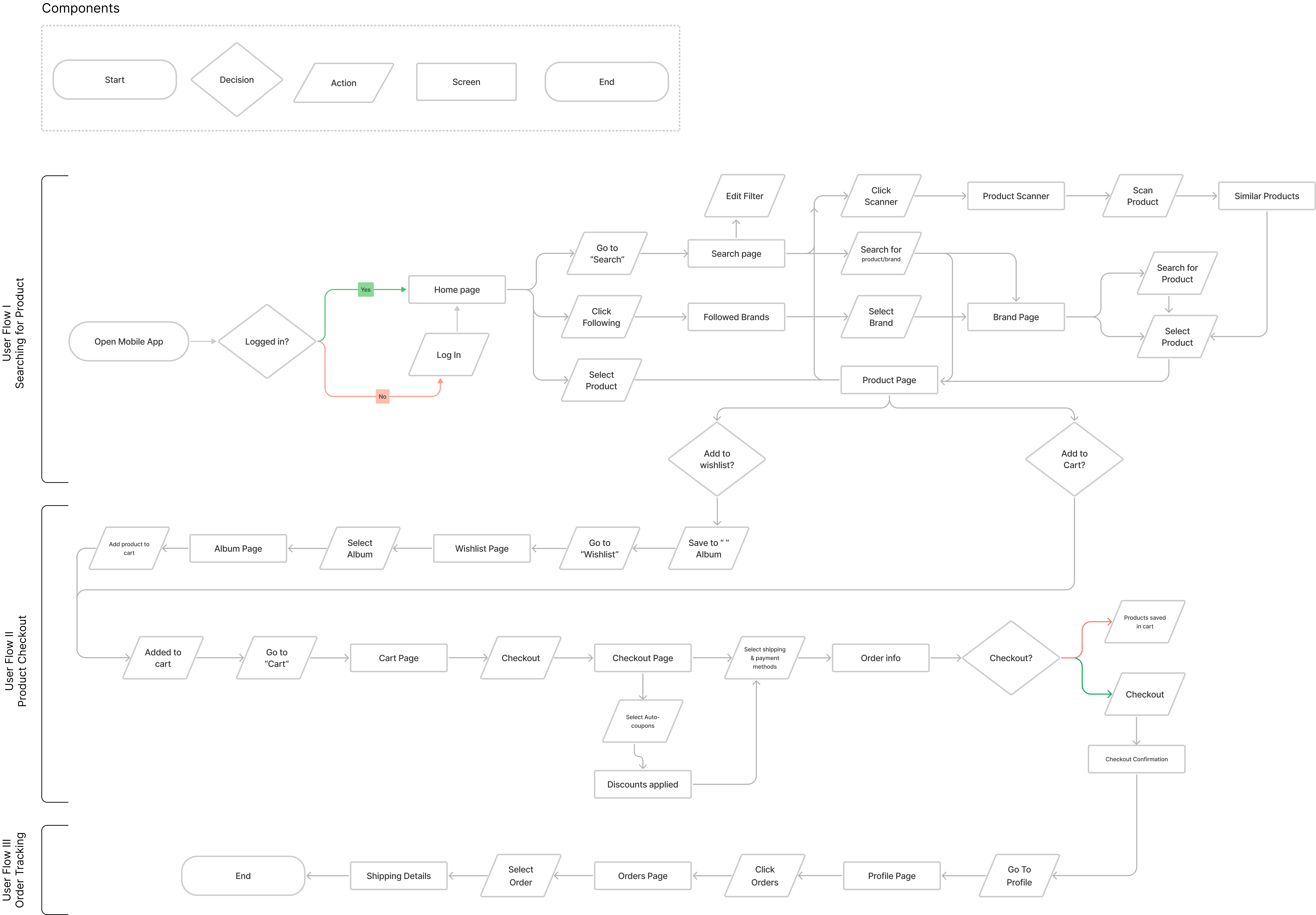
USER FLOW
My user flows helped me understand how I wanted each screen to be laid out in order for users to complete their tasks. From my MVP’s I chose three routes that were essential to 1985.
SKETCHING
Sketching helped me bring the apps user flows to life. During this process, I grasped an overall idea of how I wanted the app to feel and look --- modern and minimalistic.
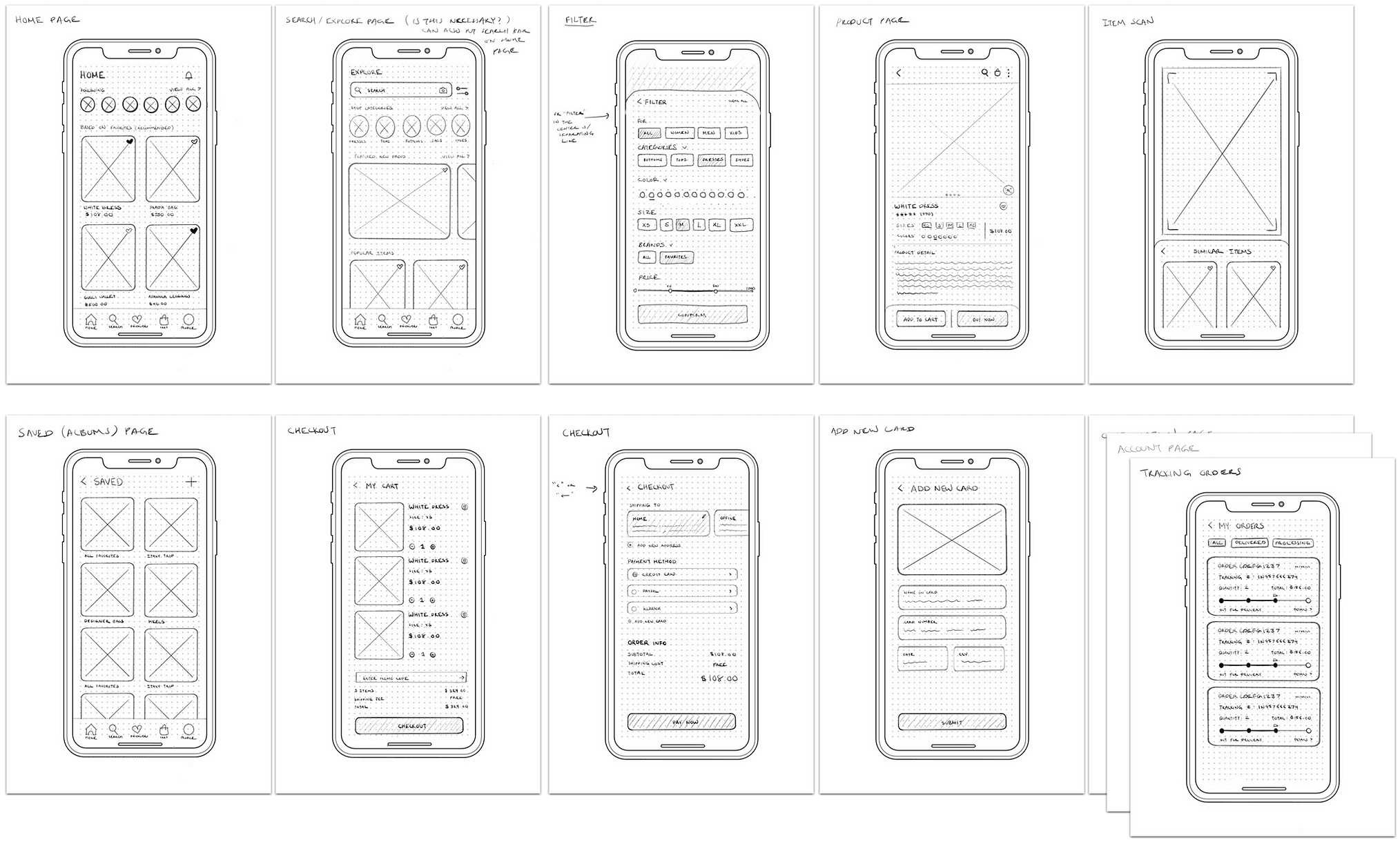
WIREFRAMES
I began working in Figma and converted those sketches into low fidelity wireframes; doing so helped clarify how I wanted functions spaced out on screen as well as give me much better insight into how I could simplify and prioritize functions.


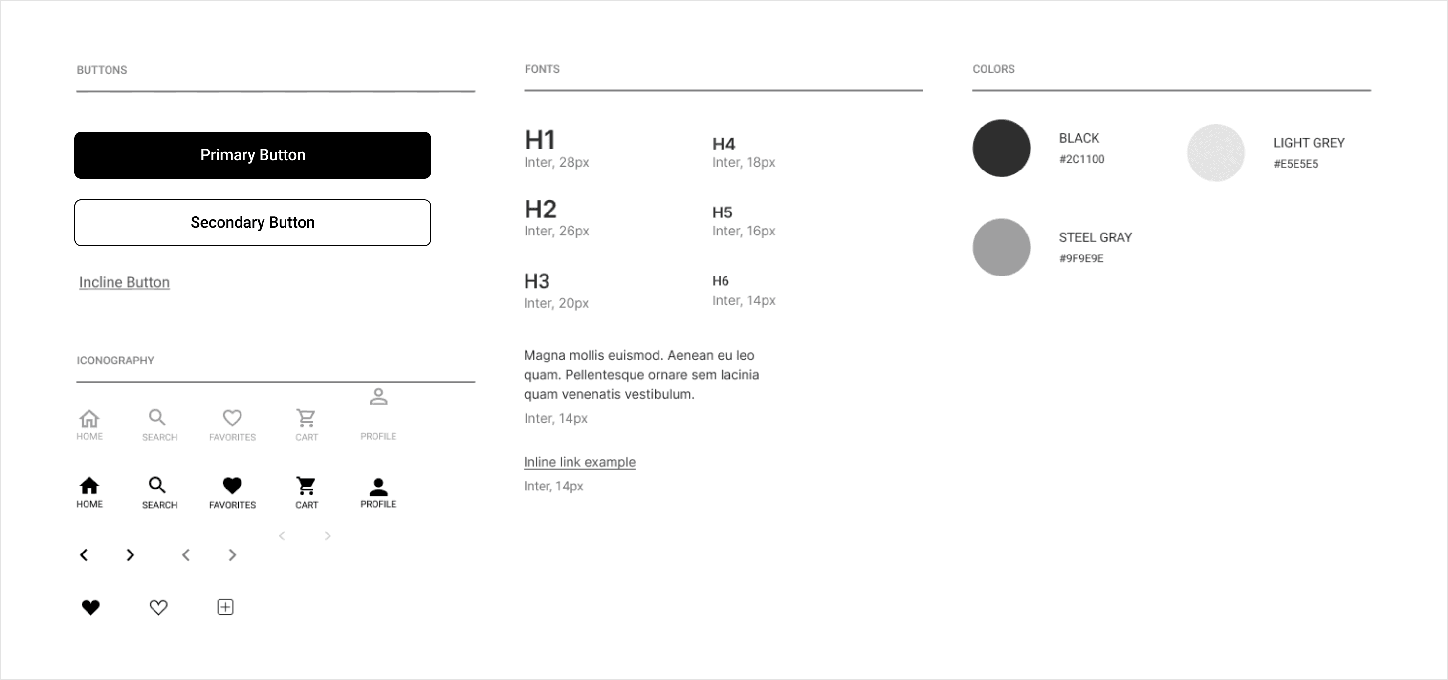
STYLE GUIDE
To keep the design consistent throughout the app, I created a style guide for the main fonts, iconography, and colorways.
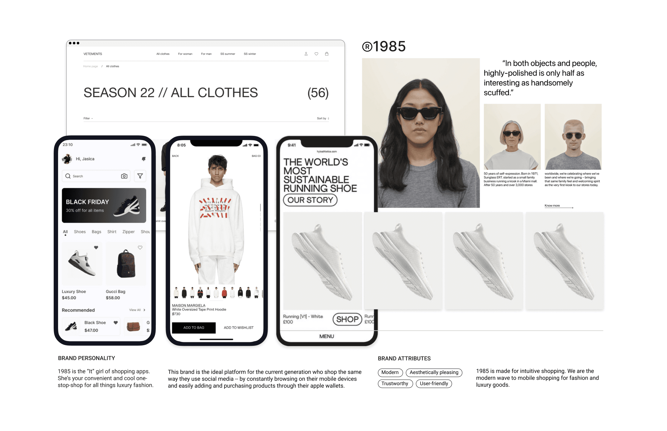
FINAL HIFI SCREENS
The main goal in the design process was to make a simplistic experience for users to follow and enjoy the journey of caring for their plants. I made a few changes along the way, allowing me to make better use of space and reconstruct certain aspects of the app.
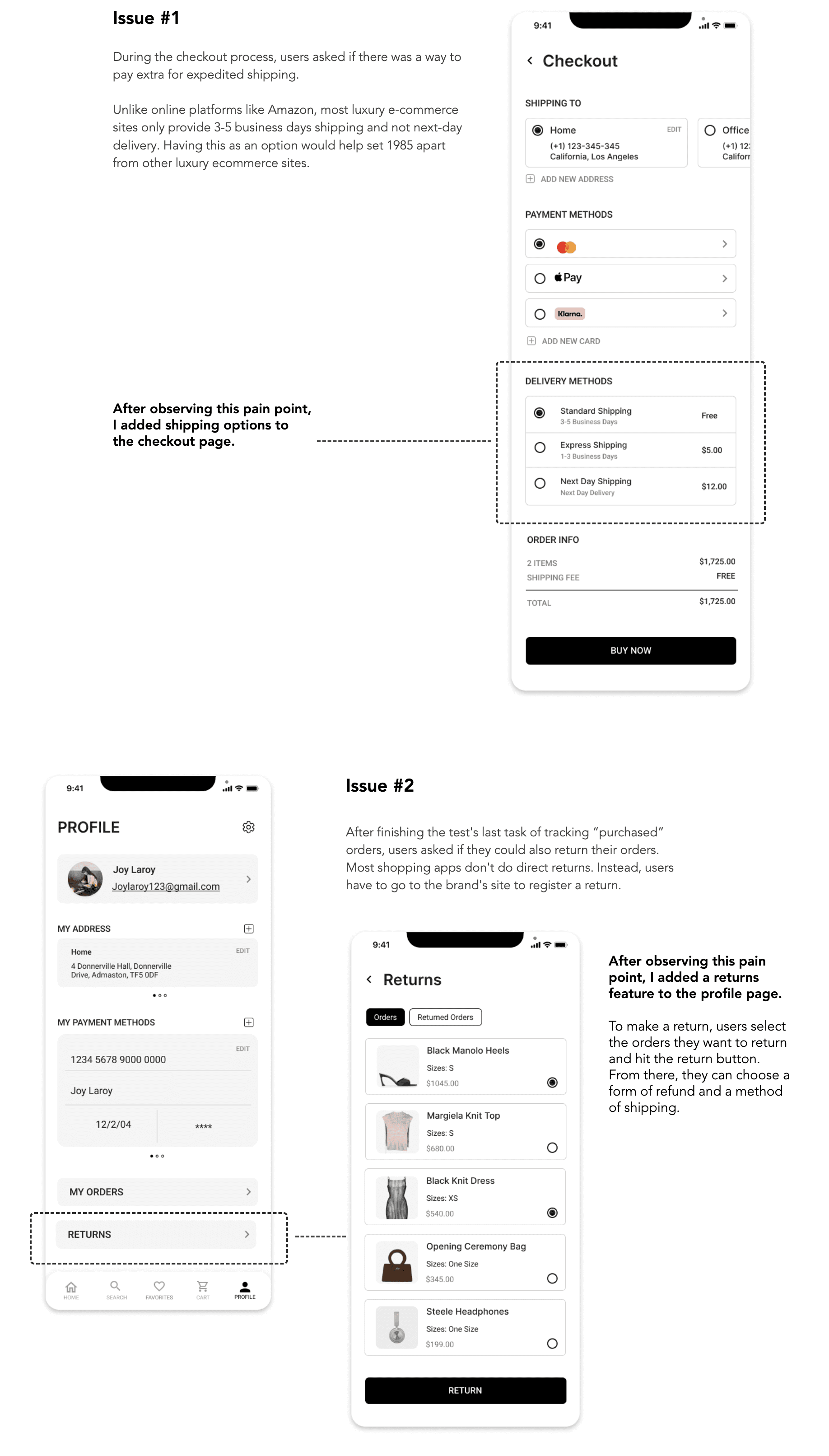
USABILITY TESTING & REDESIGN
Ready for usability testing, I set out to assess how users navigate and complete tasks in the app, with participants drawn from prior survey respondents.
Our objectives were to gauge users' initial impressions, identify pain points in navigation, understand user feelings during usage, observe user reactions, and pinpoint the product's strong and successful attributes.
During testing, no significant design changes were demanded. However, users expressed interest in experiencing certain features they considered important for the app.
TAKEAWAY
Looking back on my experience with the luxury eCommerce app "1985", it's clear how much I've grown and learned through the process. The project was born out of a need to address the everyday challenges faced by mobile shoppers. Complex checkout procedures, inadequate order tracking, and a clear bias towards desktop interfaces, particularly among luxury brands, all contribute to a substandard mobile shopping experience.
With 1985, my ambition was to redefine this experience. I built an app that’s not only user-friendly but also effectively bridges the gap between the expected and the actual mobile shopping journey. The cornerstone of this vision was an intuitive platform that offered intelligent product recommendations, a feature noticeably absent from traditional sites.
Starting my journey, I had preconceived notions about user needs and what the app's essential features were going to be. However, diving deep into the user research phase, I learned a valuable lesson - the user's perspective can drastically differ from my own. The value of one-on-one interviews became increasingly evident as I began to truly understand and accommodate the authentic needs of users, debunking my initial assumptions.
This project was an immense undertaking, given the myriad of user flows and features I aimed to incorporate. Despite the enormity of the task, the process as whole was very gratifying. I'm immensely satisfied with the outcome and excited about the learnings I've gathered along the way!
1985 Shopping App
Web app that provides remote access to healthcare services.
Experience the future of mobile shopping with 1985, a user-friendly app that streamlines your shopping process. Enjoy features that let you save favorites, find deals, and track orders with ease.
ROLE
UX/UI Designer
TOOLS
Miro, Zoom, Figma, Slack
PROCESS
Research, Ideation, Wireframing, Hi-Fi Mockups, Developer Handoff
PROBLEM
Mobile users face challenges with online shopping due to poor functionality and usability, such as difficult checkouts and order tracking. Brands often favor desktop sites over mobile, leading to inconsistent user experiences. Luxury fashion brands in particular often deter direct mobile purchases, causing repeated frustration for users shopping on multiple sites.
SOLUTION
To tackle mobile shopping issues, I developed 1985, a feature-rich, user-friendly app. It provides missing functions from traditional sites, like saving products, finding deals, quick checkouts, and order tracking. Additionally, 1985 recommends products based on user preferences, following brands, liked items, and trending products.
PRIMARY RESEARCH
To gain insight into how users access medical care, I used screener surveys to recruit participants. I conducted user interviews and qualitative and quantitative surveys. From these sources, I found the following main painpoints.
90%
of people would agree to pay through a mobile app to get an instant doctor’s consultation
64%
of people tried to find a doctor on the internet, but they could not find a doctor in most cases.
50%
of people visit the doctor when they are sick. The rest visit only one to a few times a year.
78%
of people want instant consulting services that include a short chat/call/video call.
80%
of people want to use an app, and are willing to pay more to get a more qualified doctor
50%
of people tried to use the app to consult a doctor, but they didn’t get much help.
PRIMARY RESEARCH
To gain insight into how users online shop, I used screener surveys to recruit participants. After interviewing them and collecting the data, I was able to synthesize my findings into affinity groups, empathy maps and personas.
Surveys
I first created a screening survey to find participants who online shop frequently and to evaluate how people shop across different sites.
Interviews
Then I conducted user interviews in order to get a better understanding of users' current shopping journeys and painpoints.
Affinity Mapping
With all the notes and recordings from the interviews, I created an affinity map with six categories. I then categorized my notes to create the "Frequent Online Shopper".
PERSONAS
After my research, I created personas to help understand who is the product’s users, what their frustrations and goals are, and how they will use the product.
USER STORIES
Before designing, I prioritized the app's crucial functions. By ranking user stories, I identified essential features for a seamless experience.
High Priority
I want to be able to track all my orders in one place so that I can check the shipping more easily.
I want to be updated when an item I want is on sale so that I can get it at the best price.
Medium Priority
I want to be able to compare items from different stores easily.
I want to be updated when an item I want is on sale so that I can get it at the best price.
Low Priority
I want to able to categorize my saved items.
I want to be able to see all my purchases so that I can track how much money I’m spending.
SITE MAP
With a clearer understanding of user requirements, I developed a sitemap inspired by intuitive navigation found in social media apps like Instagram. This ensured comprehensive inclusion of all essential information, functions, features, and screens.
USER FLOW
My user flows helped me understand how I wanted each screen to be laid out in order for users to complete their tasks. From my MVP’s I chose three routes that were essential to 1985.
SKETCHING
Sketching helped me bring the apps user flows to life. During this process, I grasped an overall idea of how I wanted the app to feel and look --- modern and minimalistic.
WIREFRAMES
I began working in Figma and converted those sketches into low fidelity wireframes; doing so helped clarify how I wanted functions spaced out on screen as well as give me much better insight into how I could simplify and prioritize functions.
STYLE GUIDE
To keep the design consistent throughout the app, I created a style guide for the main fonts, iconography, and colorways.
FINAL HIFI SCREENS
The main goal in the design process was to make a simplistic experience for users to follow and enjoy the journey of caring for their plants. I made a few changes along the way, allowing me to make better use of space and reconstruct certain aspects of the app.
USABILITY TESTING & REDESIGN
Ready for usability testing, I set out to assess how users navigate and complete tasks in the app, with participants drawn from prior survey respondents.
Our objectives were to gauge users' initial impressions, identify pain points in navigation, understand user feelings during usage, observe user reactions, and pinpoint the product's strong and successful attributes.
During testing, no significant design changes were demanded. However, users expressed interest in experiencing certain features they considered important for the app.
TAKEAWAY
Looking back on my experience with the luxury eCommerce app "1985", it's clear how much I've grown and learned through the process. The project was born out of a need to address the everyday challenges faced by mobile shoppers. Complex checkout procedures, inadequate order tracking, and a clear bias towards desktop interfaces, particularly among luxury brands, all contribute to a substandard mobile shopping experience.
With 1985, my ambition was to redefine this experience. I built an app that’s not only user-friendly but also effectively bridges the gap between the expected and the actual mobile shopping journey. The cornerstone of this vision was an intuitive platform that offered intelligent product recommendations, a feature noticeably absent from traditional sites.
Starting my journey, I had preconceived notions about user needs and what the app's essential features were going to be. However, diving deep into the user research phase, I learned a valuable lesson - the user's perspective can drastically differ from my own. The value of one-on-one interviews became increasingly evident as I began to truly understand and accommodate the authentic needs of users, debunking my initial assumptions.
This project was an immense undertaking, given the myriad of user flows and features I aimed to incorporate. Despite the enormity of the task, the process as whole was very gratifying. I'm immensely satisfied with the outcome and excited about the learnings I've gathered along the way!
1985 Shopping App
Mobile shopping app designed to mimic the way users browse social media.
Experience the future of mobile shopping with 1985, a user-friendly app that streamlines your shopping process. Enjoy features that let you save favorites, find deals, and track orders with ease.
ROLE
UX/UI Designer
TOOLS
Miro, Zoom, Figma, Slack
PROCESS
Research, Ideation, Wireframing, Hi-Fi Mockups, Developer Handoff
PROBLEM
Mobile users face challenges with online shopping due to poor functionality and usability, such as difficult checkouts and order tracking. Brands often favor desktop sites over mobile, leading to inconsistent user experiences. Luxury fashion brands in particular often deter direct mobile purchases, causing repeated frustration for users shopping on multiple sites.
SOLUTION
To tackle mobile shopping issues, I developed 1985, a feature-rich, user-friendly app. It provides missing functions from traditional sites, like saving products, finding deals, quick checkouts, and order tracking. Additionally, 1985 recommends products based on user preferences, following brands, liked items, and trending products.
SECONDARY RESEARCH
While doing secondary research, I found the most common problems mobile shoppers experience.
No Wishlist
Consumers often use carts as a future reference, not purchasing immediately. They may forget items or find retrieval bothersome when sites don't auto-save their selections.
Slow Checkout
Many customers have said that too many steps in the checkout process are one of the main reasons that they do not shop on their mobile devices.
Product Discovery
On large screens, customers view product image, information, and reviews simultaneously. On mobile, they typically view these elements one at a time.
Security Concerns
Statista shows 35% of people avoid mobile shopping over security fears. Retailers should thus offer diverse digital payment options for customer convenience.
Lack of Incentive
Coupons and discount codes are proven incentives for online shoppers. Offering mobile only promotions increases the incentive for users to shop on their mobile devices
Filling in Forms
Form-filling on mobile is often frustrating. Using technologies like location services and account synchronization can enhance purchase completion rates.
PRIMARY RESEARCH
To gain insight into how users online shop, I used screener surveys to recruit participants. After interviewing them and collecting the data, I was able to synthesize my findings into affinity groups, empathy maps and personas.
Surveys
I first created a screening survey to find participants who online shop frequently and to evaluate how people shop across different sites.
Interviews
Then I conducted user interviews in order to get a better understanding of users' current shopping journeys and painpoints.
Affinity & Empathy Mapping
With all the notes and recordings from the interviews, I created an affinity map with six categories. I then categorized my notes to create the "Frequent Online Shopper".
PERSONAS
After my research, I created personas to help understand who is the product’s users, what their frustrations and goals are, and how they will use the product.
USER STORIES
Before designing, I prioritized the app's crucial functions. By ranking user stories, I identified essential features for a seamless experience.
High Priority
I want to be able to track all my orders in one place so that I can check the shipping more easily.
I want to be updated when an item I want is on sale so that I can get it at the best price.
Medium Priority
I want to be able to compare items from different stores easily.
I want to be updated when an item I want is on sale so that I can get it at the best price.
Low Priority
I want to able to categorize my saved items.
I want to be able to see all my purchases so that I can track how much money I’m spending.
SITE MAP
With a clearer understanding of user requirements, I developed a sitemap inspired by intuitive navigation found in social media apps like Instagram. This ensured comprehensive inclusion of all essential information, functions, features, and screens.
USER FLOW
My user flows helped me understand how I wanted each screen to be laid out in order for users to complete their tasks. From my MVP’s I chose three routes that were essential to 1985.
SKETCHING
Sketching helped me bring the apps user flows to life. During this process, I grasped an overall idea of how I wanted the app to feel and look --- modern and minimalistic.
WIREFRAMES
I began working in Figma and converted those sketches into low fidelity wireframes; doing so helped clarify how I wanted functions spaced out on screen as well as give me much better insight into how I could simplify and prioritize functions.
STYLE GUIDE
To keep the design consistent throughout the app, I created a style guide for the main fonts, iconography, and colorways.
FINAL HIFI SCREENS
The main goal in the design process was to make a simplistic experience for users to follow and enjoy the journey of caring for their plants. I made a few changes along the way, allowing me to make better use of space and reconstruct certain aspects of the app.
USABILITY TESTING & REDESIGN
Ready for usability testing, I set out to assess how users navigate and complete tasks in the app, with participants drawn from prior survey respondents.
Our objectives were to gauge users' initial impressions, identify pain points in navigation, understand user feelings during usage, observe user reactions, and pinpoint the product's strong and successful attributes.
During testing, no significant design changes were demanded. However, users expressed interest in experiencing certain features they considered important for the app.
TAKEAWAY
Looking back on my experience with the luxury eCommerce app "1985", it's clear how much I've grown and learned through the process. The project was born out of a need to address the everyday challenges faced by mobile shoppers. Complex checkout procedures, inadequate order tracking, and a clear bias towards desktop interfaces, particularly among luxury brands, all contribute to a substandard mobile shopping experience.
With 1985, my ambition was to redefine this experience. I built an app that’s not only user-friendly but also effectively bridges the gap between the expected and the actual mobile shopping journey. The cornerstone of this vision was an intuitive platform that offered intelligent product recommendations, a feature noticeably absent from traditional sites.
Starting my journey, I had preconceived notions about user needs and what the app's essential features were going to be. However, diving deep into the user research phase, I learned a valuable lesson - the user's perspective can drastically differ from my own. The value of one-on-one interviews became increasingly evident as I began to truly understand and accommodate the authentic needs of users, debunking my initial assumptions.
This project was an immense undertaking, given the myriad of user flows and features I aimed to incorporate. Despite the enormity of the task, the process as whole was very gratifying. I'm immensely satisfied with the outcome and excited about the learnings I've gathered along the way!