MD+ Web App
Web app that provides remote access to healthcare services.
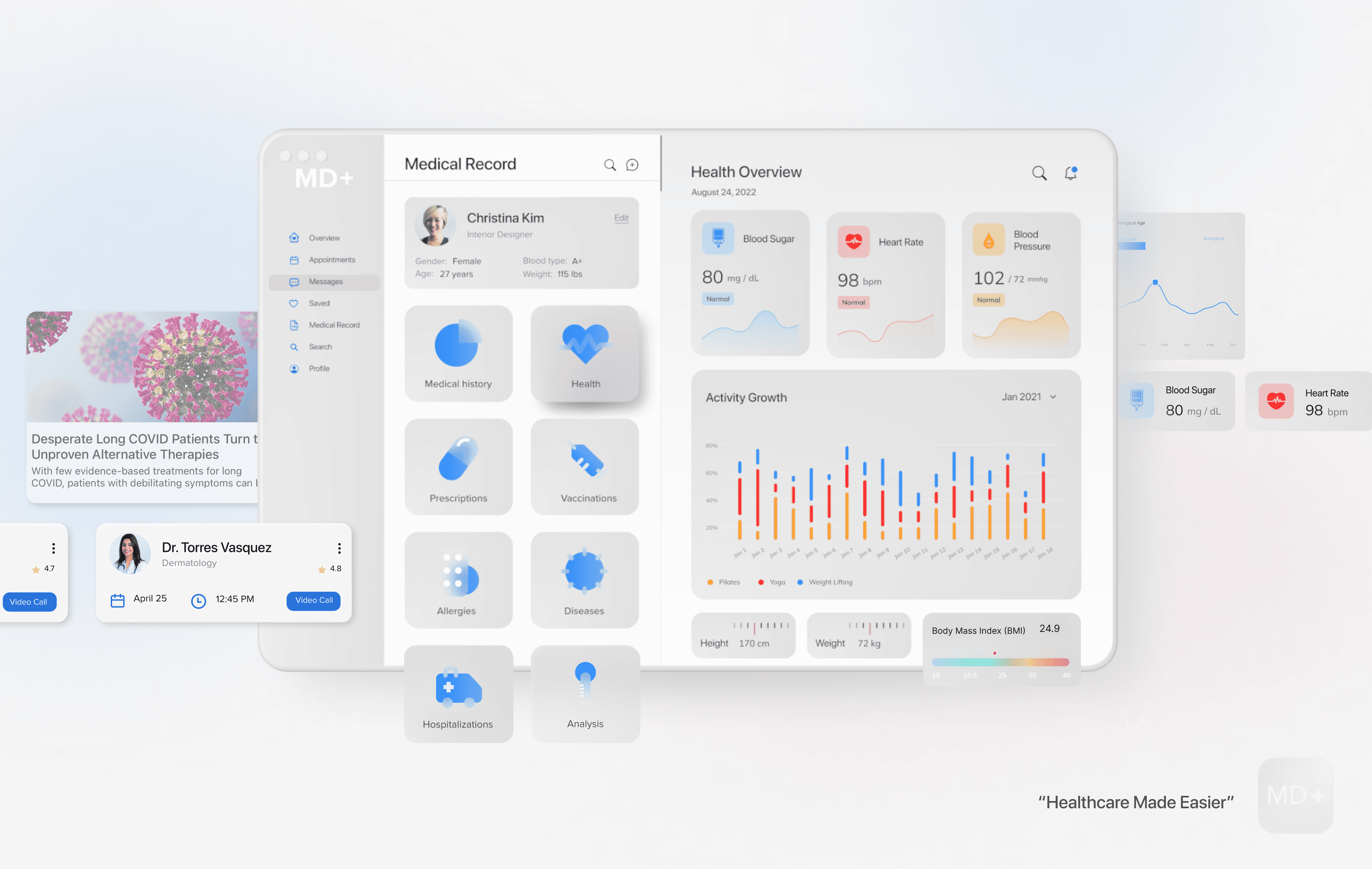

MD+ is a medical information and communication technology solution that simplifies remote access to healthcare services.
ROLE
UX/UI Designer
TOOLS
Miro, Zoom, Figma, Slack
PROCESS
Research, Ideation, Wireframing, Hi-Fi Mockups, Developer Handoff
PROBLEM
Doctor visits can be tedious and fraught with challenges, from making appointments to navigating hospital inefficiencies. This often leads patients to attempt self-diagnosis at home, bypassing professional medical consultation, which could pose risks to their health.
SOLUTION
MD+ web app streamlines healthcare by enabling symptom checks, instant communication with medical professionals, hassle-free online appointments, personal health record storage, and timely notifications for consultations and relevant medical news, all in one space. This intuitive platform is designed to provide accessible, convenient, and trustworthy online healthcare.
PRIMARY RESEARCH
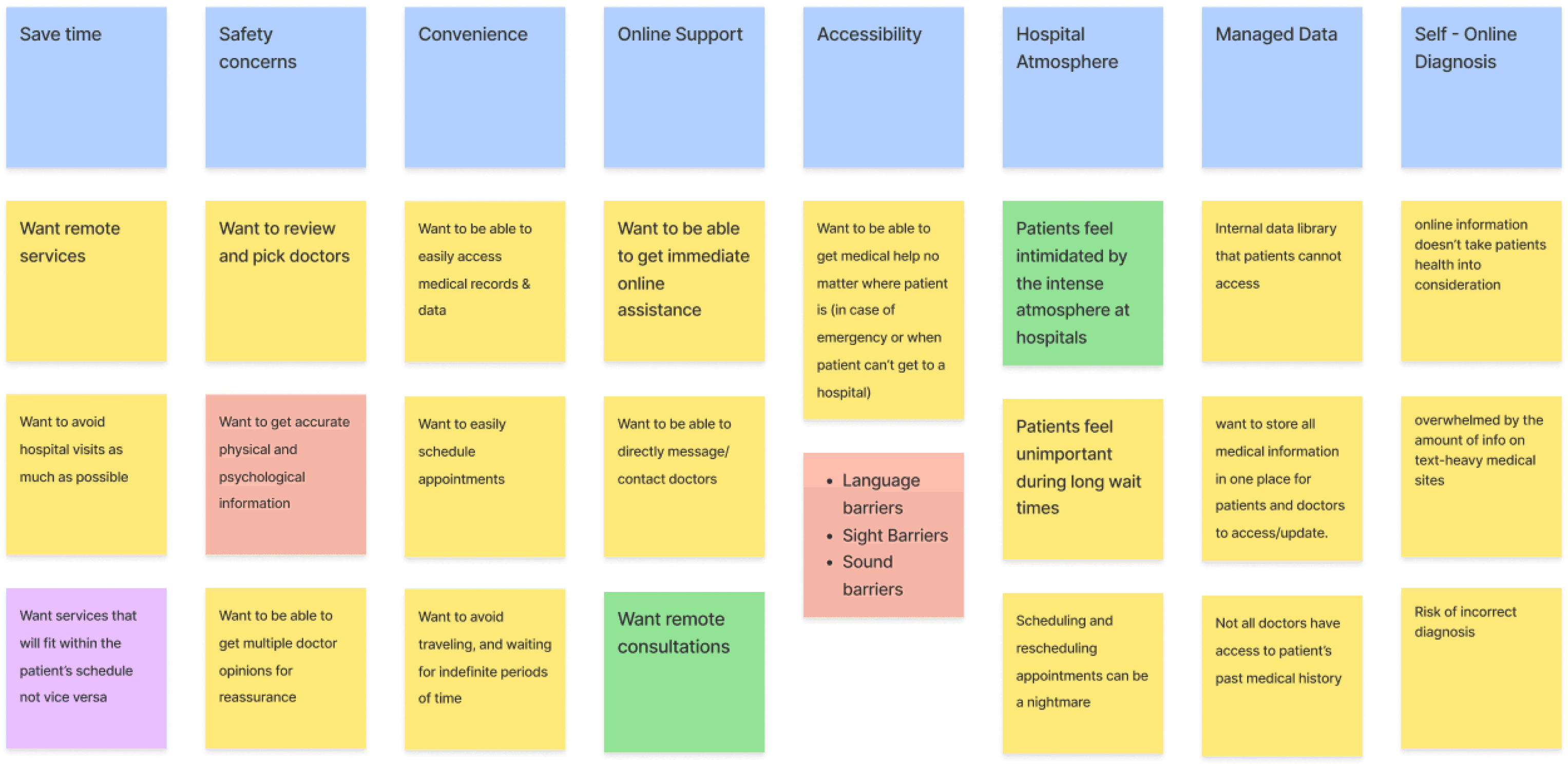
To gain insight into how users access medical care, I used screener surveys to recruit participants. I conducted user interviews and qualitative and quantitative surveys. From these sources, I found the following main painpoints.
90%
of people would agree to pay through a mobile app to get an instant doctor’s consultation
64%
of people tried to find a doctor on the internet, but they could not find a doctor in most cases.
80%
of people want to use an app, and are willing to pay more to get a more qualified doctor
50%
of people visit the doctor when they are sick. The rest visit only one to a few times a year.
78%
of people want instant consulting services that include a short chat/call/video call.
50%
of people tried to use the app to consult a doctor, but they didn’t get much help.
PERSONAS
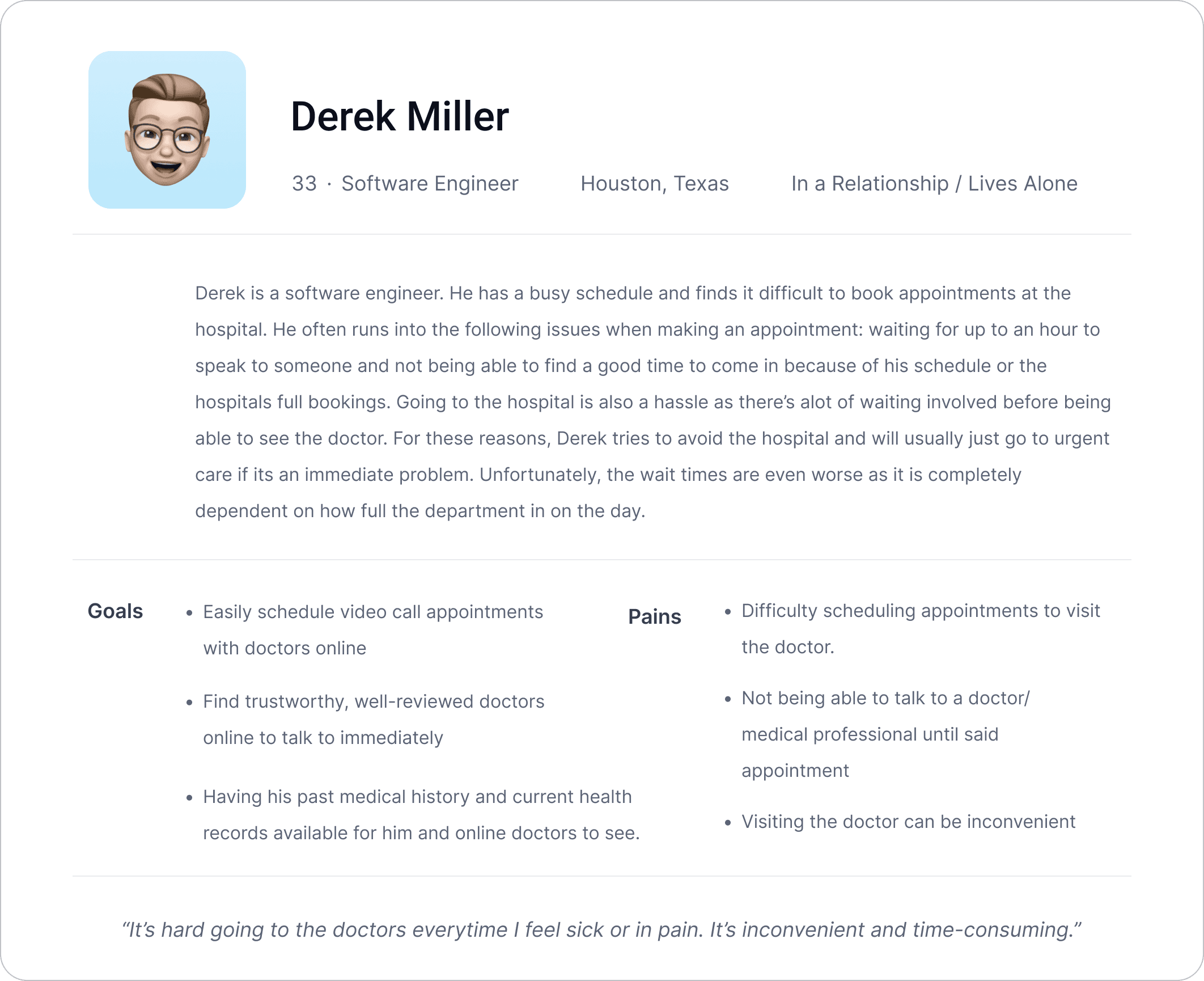
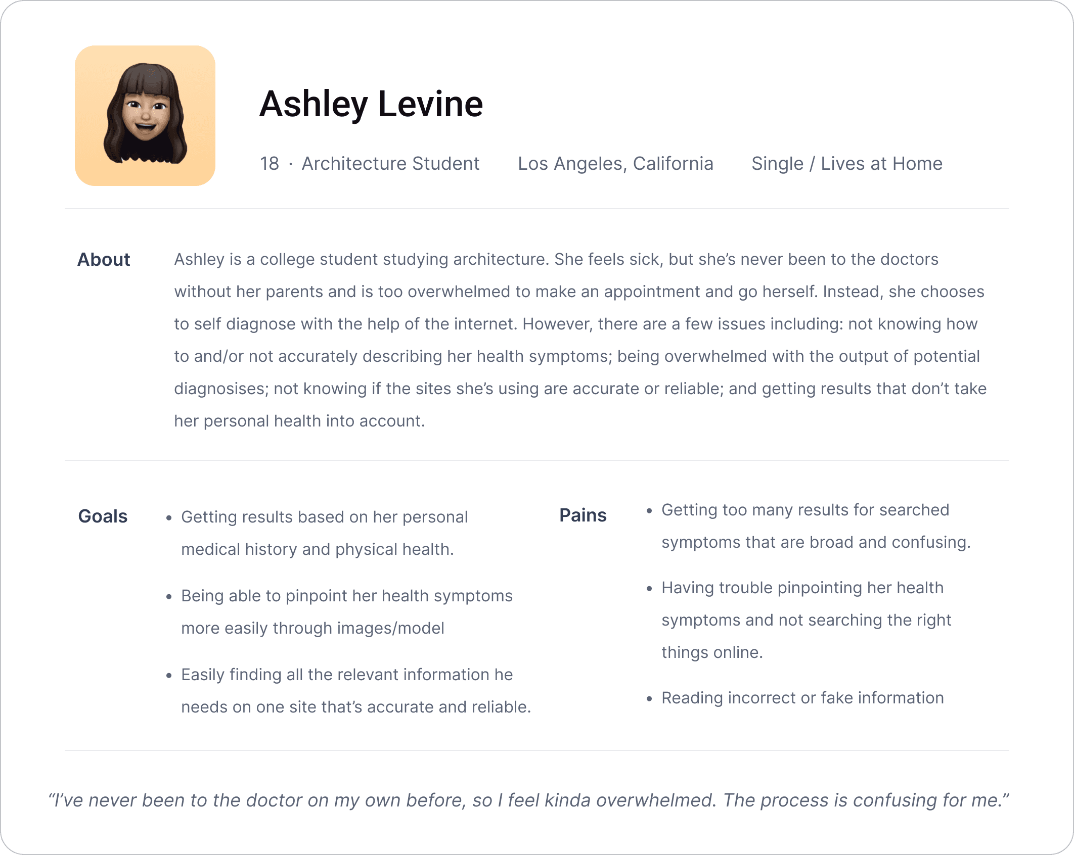
After my research, I created personas to help understand who is the product’s users, what their frustrations and goals are, and how they will use the product.
USER STORIES
Before designing, I prioritized the app's crucial functions. By ranking user stories, I identified essential features for a seamless experience.
High Priority
Users need the app to identify their issues and provide relevant information.
The app should employ a 3D model to highlight pain points.
The app should have certified professionals write information and reply to questions online.
Medium Priority
The app should offer online appointments with healthcare professionals.
Users should be able to chat and make calls with a selection of online healthcare professionals.
The app should allow users to update their medical records.
Low Priority
The app should offer a selection of healthcare professionals with varying rates for online services.
Healthcare professionals' profiles should display ratings and reviews.
USER FLOW
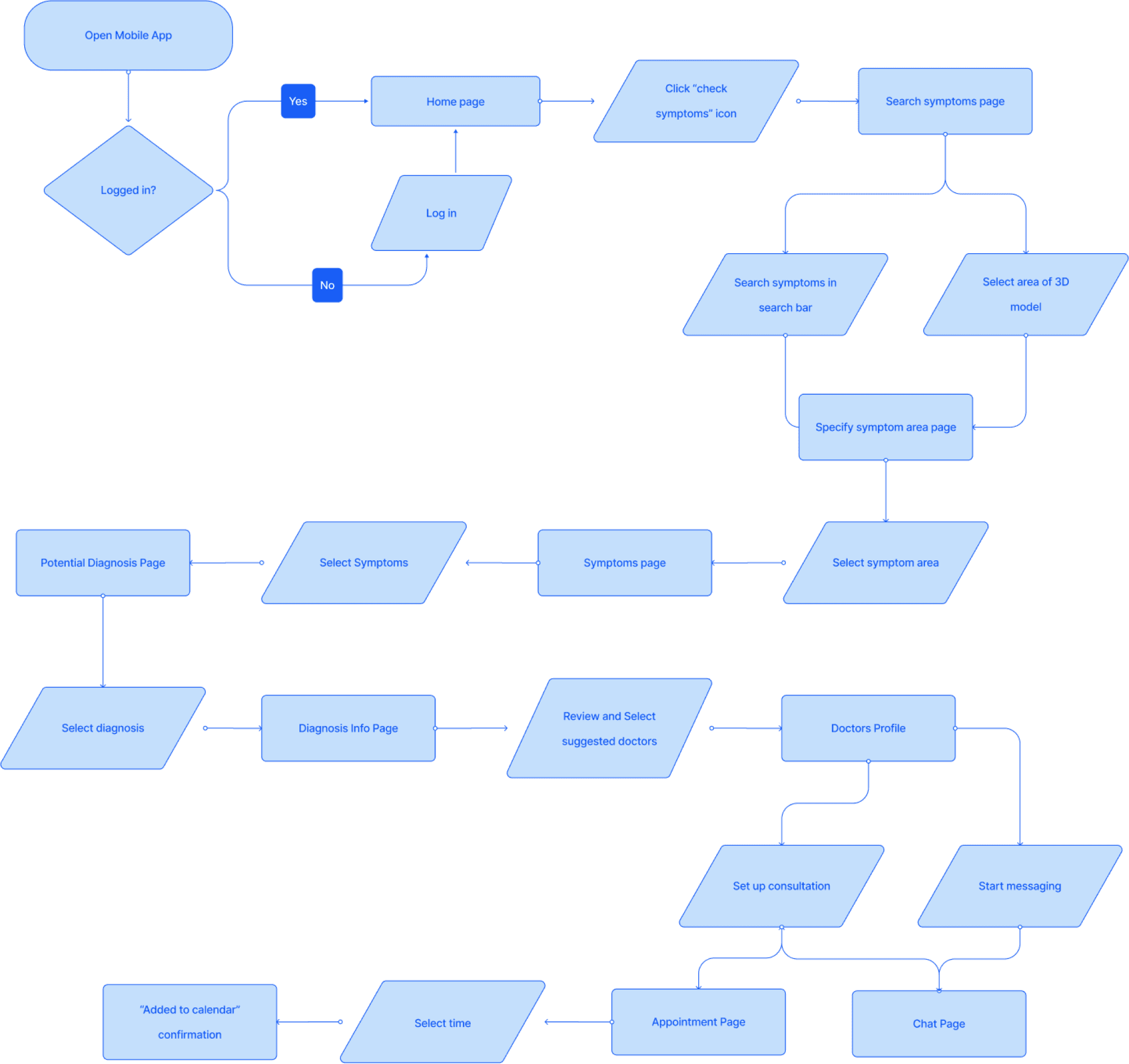
After collecting all my research data and creating my personas, I developed a main user flow to determine how each screen would be laid out in order for users to complete their tasks.
WIREFRAMES
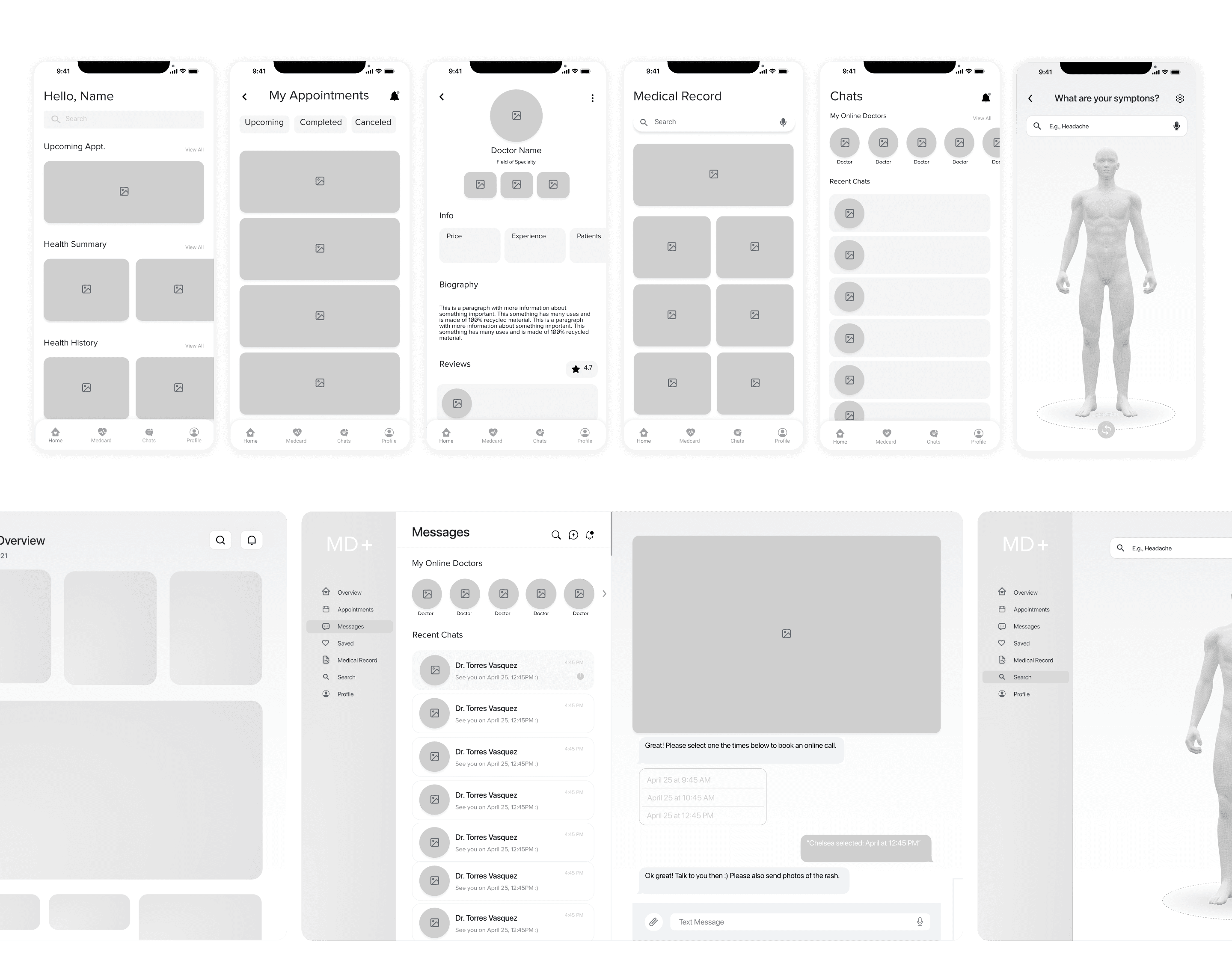
After creating a user flow, I designed mobile and desktop app wireframes. These wireframes covered the users' core needs and helped to determine each screen's content layout and functionality.
STYLE GUIDE
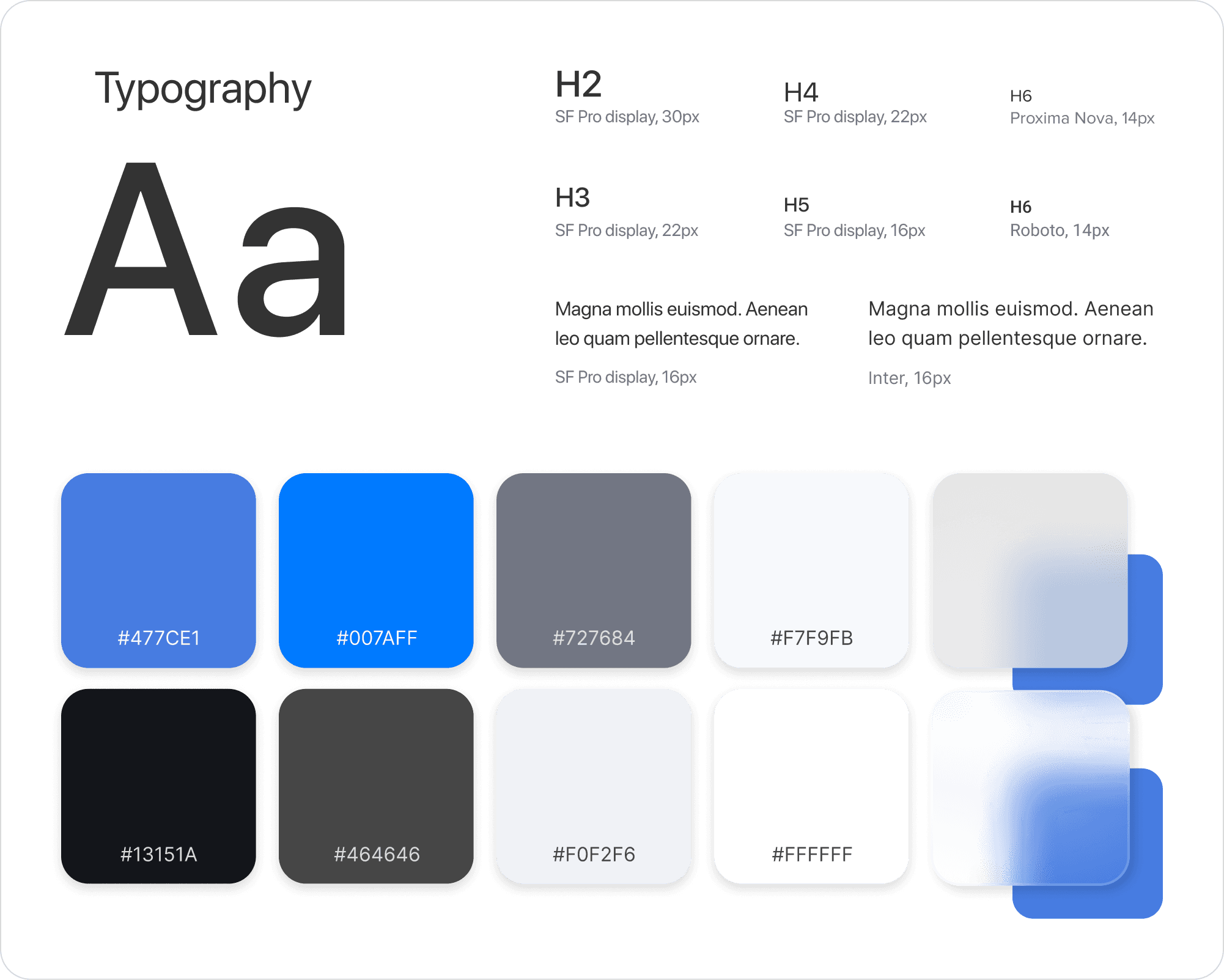
Maintaining design consistency, I crafted a style guide covering main fonts, icons, and color schemes. I opted for SF pro display for its accessibility and chose shades of blue - symbolizing credibility, trust, and professionalism - qualities revered in the medical community.
FINAL HIFI SCREENS
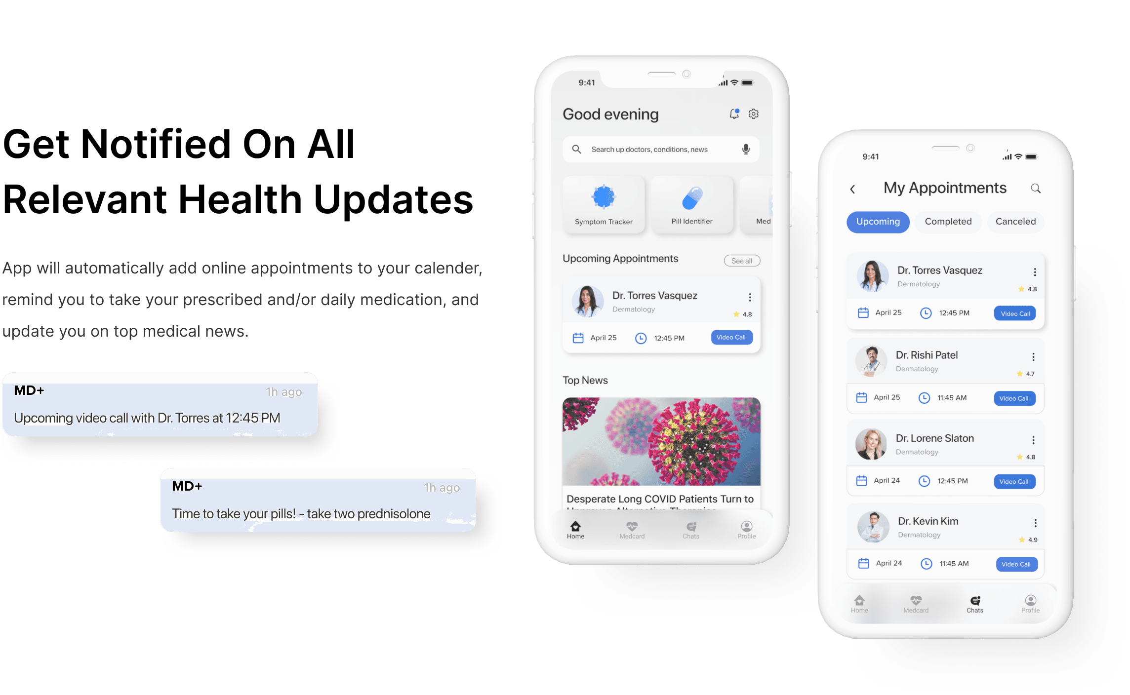
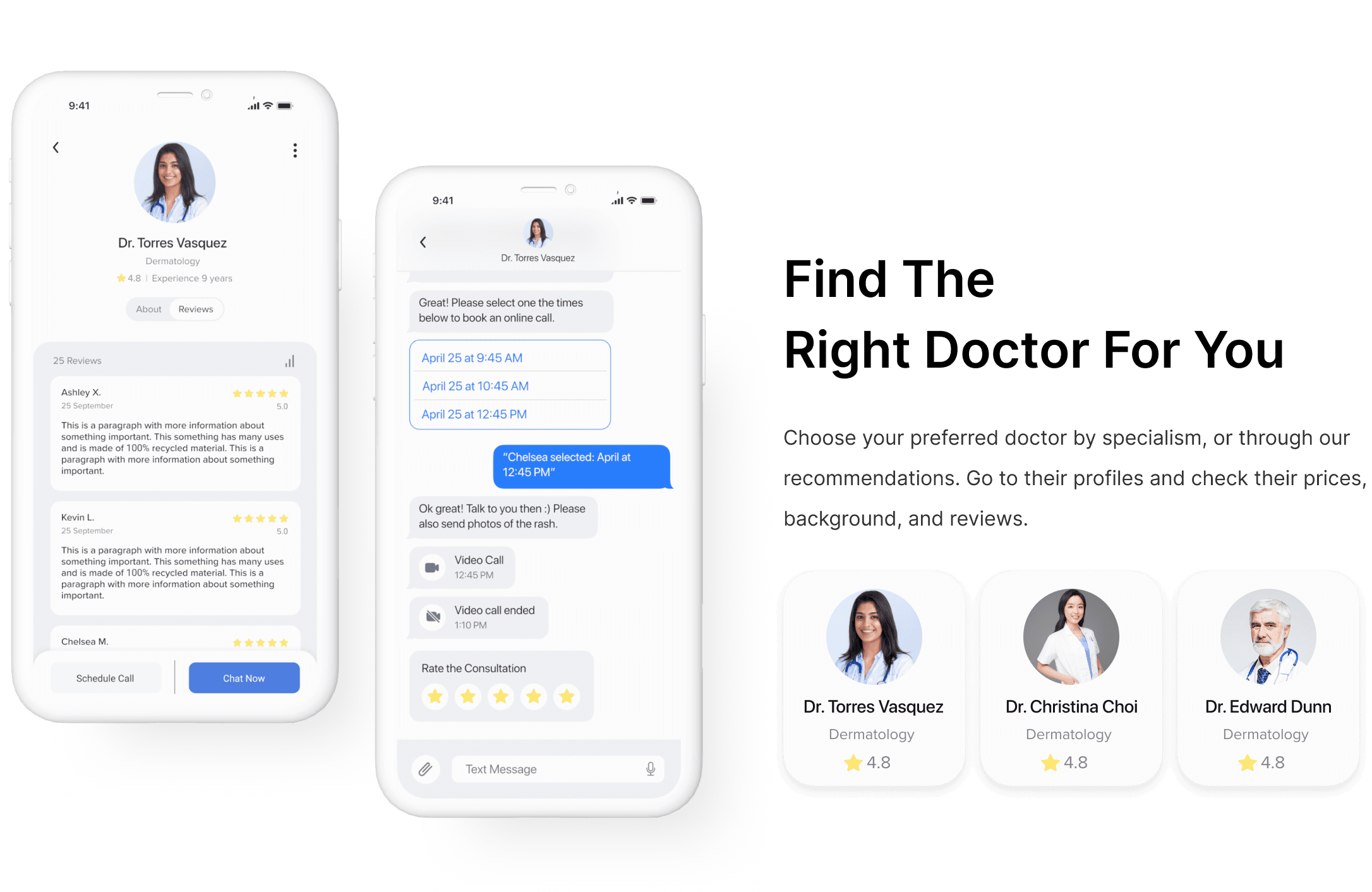
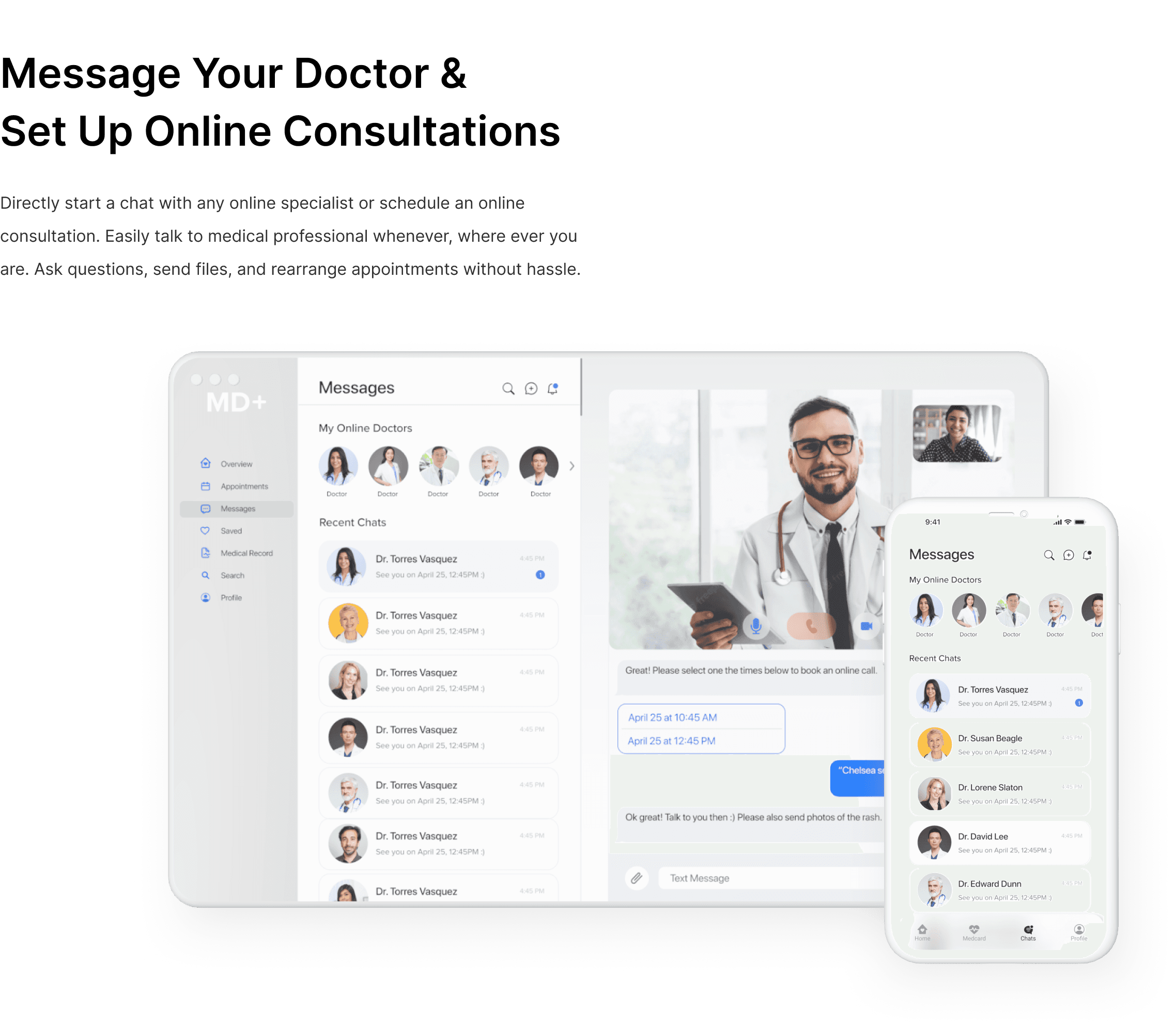
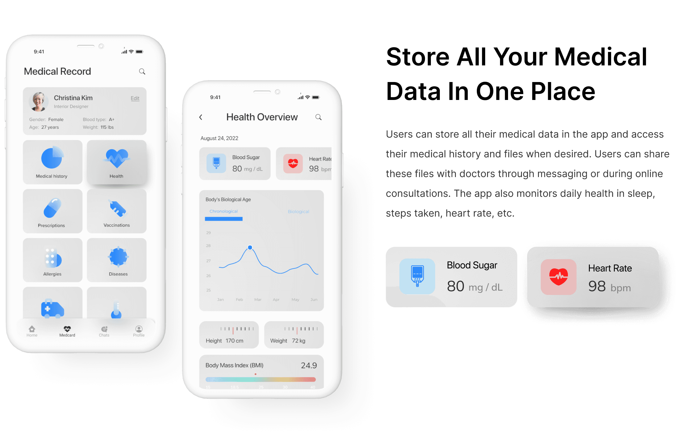
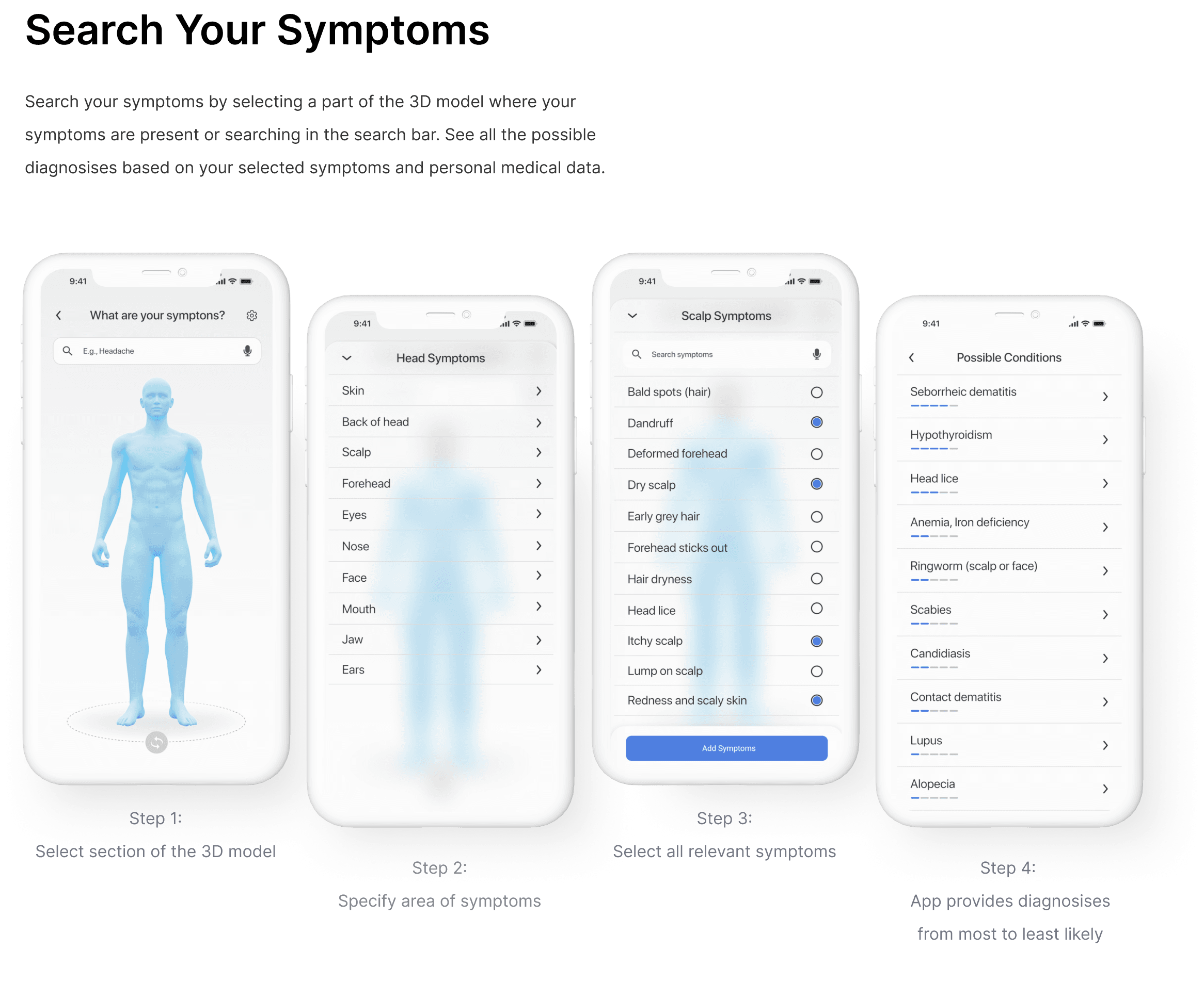
After creating a visual style guide, I turned my wireframes into high-fidelity screens. These high-fidelity screens cover the main user flows including: checking your symptoms, storing your medical data, selecting a specialist, direct messaging specialists and scheduling online consultations.





TAKEAWAY
Crafting the UI for the app was detailed and iterative, informed by color and typography research. Despite healthcare's advancement and cutting edge technology, its digital platforms often feel dated. I aimed to bridge this gap, designing an app that matches the sophistication of the healthcare industry, and thereby ensuring the best possible user experience.
Going forward, I’m excited to tackle new UX prompts and better my UI skills. Thank you for reading through! I hope you enjoyed learning about my design and thought process.
MD+ Web App
Web app that provides remote access to healthcare services.


MD+ is a medical information and communication technology solution that simplifies remote access to healthcare services.
ROLE
UX/UI Designer
TOOLS
Miro, Zoom, Figma, Slack
PROCESS
Research, Ideation, Wireframing, Hi-Fi Mockups, Developer Handoff
PROBLEM
Doctor visits can be tedious and fraught with challenges, from making appointments to navigating hospital inefficiencies. This often leads patients to attempt self-diagnosis at home, bypassing professional medical consultation, which could pose risks to their health.
SOLUTION
MD+ web app streamlines healthcare by enabling symptom checks, instant communication with medical professionals, hassle-free online appointments, personal health record storage, and timely notifications for consultations and relevant medical news, all in one space. This intuitive platform is designed to provide accessible, convenient, and trustworthy online healthcare.
PRIMARY RESEARCH
To gain insight into how users access medical care, I used screener surveys to recruit participants. I conducted user interviews and qualitative and quantitative surveys. From these sources, I found the following main painpoints.
90%
of people would agree to pay through a mobile app to get an instant doctor’s consultation
64%
of people tried to find a doctor on the internet, but they could not find a doctor in most cases.
50%
of people visit the doctor when they are sick. The rest visit only one to a few times a year.
78%
of people want instant consulting services that include a short chat/call/video call.
80%
of people want to use an app, and are willing to pay more to get a more qualified doctor
50%
of people tried to use the app to consult a doctor, but they didn’t get much help.

PERSONAS
After my research, I created personas to help understand who is the product’s users, what their frustrations and goals are, and how they will use the product.


USER STORIES
Before designing, I prioritized the app's crucial functions. By ranking user stories, I identified essential features for a seamless experience.
High Priority
Users need the app to identify their issues and provide relevant information.
The app should employ a 3D model to highlight pain points.
The app should have certified professionals write information and reply to questions online.
Medium Priority
The app should offer online appointments with healthcare professionals.
Users should be able to chat and make calls with a selection of online healthcare professionals.
The app should allow users to update their medical records.
Low Priority
The app should offer a selection of healthcare professionals with varying rates for online services.
Healthcare professionals' profiles should display ratings and reviews.
USER FLOW
After collecting all my research data and creating my personas, I developed a main user flow to determine how each screen would be laid out in order for users to complete their tasks.

WIREFRAMES
After creating a user flow, I designed mobile and desktop app wireframes. These wireframes covered the users' core needs and helped to determine each screen's content layout and functionality.

STYLE GUIDE
Maintaining design consistency, I crafted a style guide covering main fonts, icons, and color schemes. I opted for SF pro display for its accessibility and chose shades of blue - symbolizing credibility, trust, and professionalism - qualities revered in the medical community.

FINAL HIFI SCREENS
After creating a visual style guide, I turned my wireframes into high-fidelity screens. These high-fidelity screens cover the main user flows including: checking your symptoms, storing your medical data, selecting a specialist, direct messaging specialists and scheduling online consultations.


TAKEAWAY
Crafting the UI for the app was detailed and iterative, informed by color and typography research. Despite healthcare's advancement and cutting edge technology, its digital platforms often feel dated. I aimed to bridge this gap, designing an app that matches the sophistication of the healthcare industry, and thereby ensuring the best possible user experience.
Going forward, I’m excited to tackle new UX prompts and better my UI skills. Thank you for reading through! I hope you enjoyed learning about my design and thought process.
MD+ Web App
Medical web app that provides remote access to healthcare services.

MD+ is a medical information and communication technology solution that simplifies remote access to healthcare services.
ROLE
UX/UI Designer
TOOLS
Miro, Zoom, Figma, Slack
PROCESS
Research, Ideation, Wireframing, Hi-Fi Mockups, Developer Handoff
PROBLEM
Doctor visits can be tedious and fraught with challenges, from making appointments to navigating hospital inefficiencies. This often leads patients to attempt self-diagnosis at home, bypassing professional medical consultation, which could pose risks to their health.
SOLUTION
MD+ web app streamlines healthcare by enabling symptom checks, instant communication with medical professionals, hassle-free online appointments, personal health record storage, and timely notifications for consultations and relevant medical news, all in one space. This intuitive platform is designed to provide accessible, convenient, and trustworthy online healthcare.
PRIMARY RESEARCH
To gain insight into how users access medical care, I used screener surveys to recruit participants. I conducted user interviews and qualitative and quantitative surveys. From these sources, I found the following main painpoints.
90%
of people would agree to pay through a mobile app to get an instant doctor’s consultation
64%
of people tried to find a doctor on the internet, but they could not find a doctor in most cases.
80%
of people want to use an app, and are willing to pay more to get a more qualified doctor
50%
of people visit the doctor when they are sick. The rest visit only one to a few times a year.
78%
of people want instant consulting services that include a short chat/call/video call.
50%
of people tried to use the app to consult a doctor, but they didn’t get much help.

PERSONAS
After my research, I created personas to help understand who is the product’s users, what their frustrations and goals are, and how they will use the product.


USER STORIES
Before designing, I prioritized the app's crucial functions. By ranking user stories, I identified essential features for a seamless experience.
High Priority
Users need the app to identify their issues and provide relevant information.
The app should employ a 3D model to highlight pain points.
The app should have certified professionals write information and reply to questions online.
Medium Priority
The app should offer online appointments with healthcare professionals.
Users should be able to chat and make calls with a selection of online healthcare professionals.
The app should allow users to update their medical records.
Low Priority
The app should offer a selection of healthcare professionals with varying rates for online services.
Healthcare professionals' profiles should display ratings and reviews.
USER FLOW
After collecting all my research data and creating my personas, I developed a main user flow to determine how each screen would be laid out in order for users to complete their tasks.

WIREFRAMES
After creating a user flow, I designed mobile and desktop app wireframes. These wireframes covered the users' core needs and helped to determine each screen's content layout and functionality.

STYLE GUIDE
Maintaining design consistency, I crafted a style guide covering main fonts, icons, and color schemes. I opted for SF pro display for its accessibility and chose shades of blue - symbolizing credibility, trust, and professionalism - qualities revered in the medical community.

FINAL HIFI SCREENS
After creating a visual style guide, I turned my wireframes into high-fidelity screens. These high-fidelity screens cover the main user flows including: checking your symptoms, storing your medical data, selecting a specialist, direct messaging specialists and scheduling online consultations.


TAKEAWAY
Crafting the UI for the app was detailed and iterative, informed by color and typography research. Despite healthcare's advancement and cutting edge technology, its digital platforms often feel dated. I aimed to bridge this gap, designing an app that matches the sophistication of the healthcare industry, and thereby ensuring the best possible user experience.
Going forward, I’m excited to tackle new UX prompts and better my UI skills. Thank you for reading through! I hope you enjoyed learning about my design and thought process.


